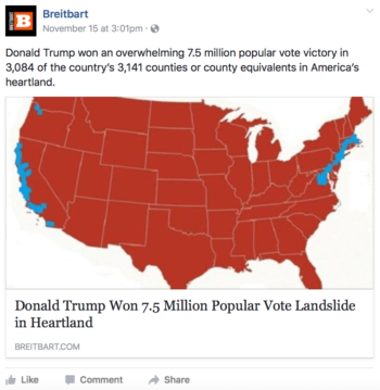
In the days following the 2016 US election hyper-partisan online news site Breitbart published a map of the US saying that Trump had won by 7.5 million votes. Of course, we now know that he lost the popular vote by 3 million, but by the time Breitbart had corrected the story it had already been shared thousands of times (35,000 shares, 59,000 likes) and the uncorrected piece one was not taken down. That fake news spreads far and wide is not longer news, but the success of Breibart’s article may have been helped by the inclusion of the authoritive-looking, yet utterly bogus map (seen below), showing almost all of the US covered in red (Republicans) with a diminutive splash of blue (Democrats) in California and areas in or near New York. The correct map of the county election results is sitting to the right.
 [fusion_builder_container hundred_percent=")
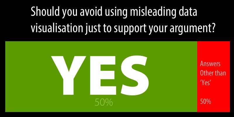
It has become remarkably simple to create a valid-looking website, which to the unassuming eye resembles an official, big-name news outlet. But as if verifying text content wasn’t hard enough, seductive visualisations; graphs, charts, and maps, made with free tools found anywhere on the internet, can make fact checking even harder.
In an increasingly data-saturated world, individuals without the necessary skills to interpret the visualisation of that data with a critical eye are at a disadvantage. Indeed, while there is no shortage of disinformation and “FAKE NEWS!” around, there is also estimated to be a deficit of 500,000 data scientists and statisticians in the EU, meaning plenty of opportunities for anyone with a head start in data literacy.
The ability to collect, manage, evaluate, and apply data, in a critical manner, can begin in the classroom by showing young people exactly how statistics and numbers can be doctored by anyone with a particular agenda in mind. The following selection of skewed or outright false data visualisations are all examples of how, to paraphrase Gregg Easterbrook, if you torture numbers, they’ll confess to anything. Below these you will find some links to resources for teaching and further reading.
Fancy-looking visuals
Take for example the below graph, shown in the United States Congress to convince people to de-fund Planned Parenthood:
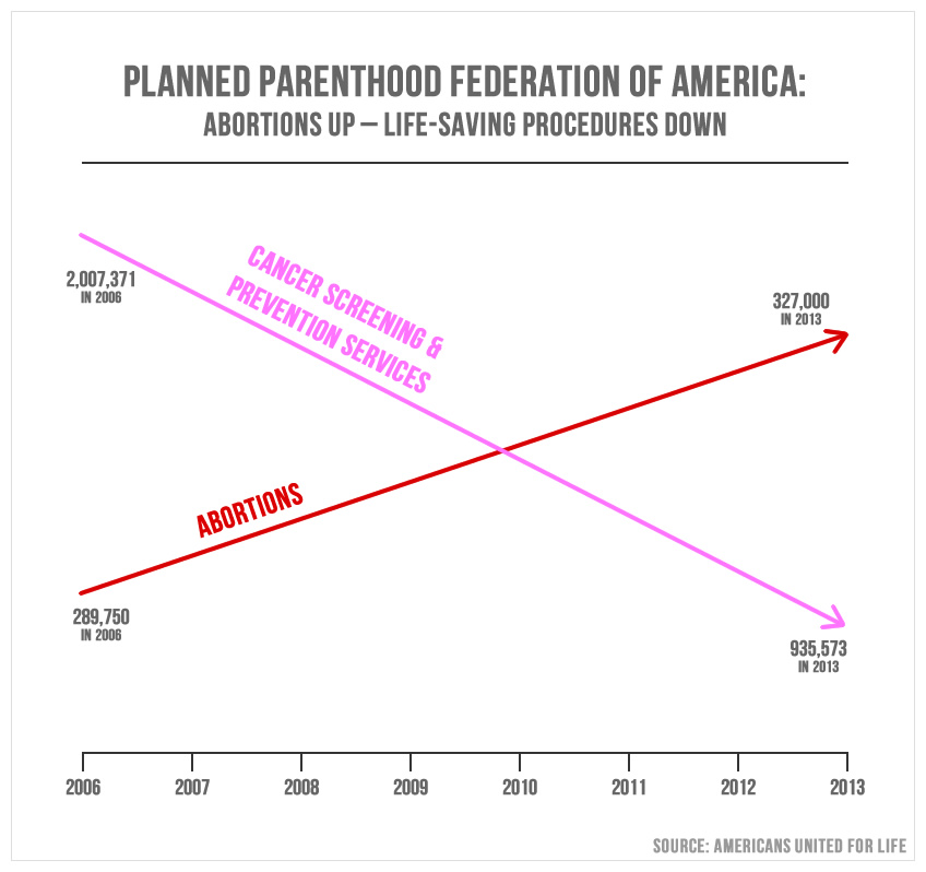
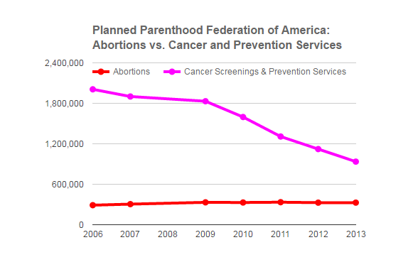
One arrow shows the amount of abortionsincreasing over time and the other shows cancer screening services decreasing, which on the face of it, is accurate. However, the graph is actually two graphs overlaid without being corrected for scale. When corrected, the graph looks like this:
PolitiFact Awards Chaffetz a Rating of “Pants on Fire” for Using Misleading Chart at Planned Parenthood Hearing – https://democrats-oversight.house.gov
Correlation ≠ Causation
Another example is to demonstrate the ways in which the relationship between correlation and causation are often abused. For example, below is a graph by Tyler Vigen from his blog and book, Spurious Correlations.
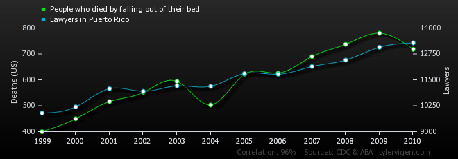
From Tyler Vigen’s blog – http://tylervigen.com/spurious-correlations
The graph, using openly-available data, correlates the number of people who died by falling out of bed with the number of lawyers in Puerto Rico. Interesting, right? Perhaps not, but it does demonstrate how easy it is to intentionally skew data in order to make a specious point.
How was the data gathered?
Representations of data and statistics can be skewed in many ways, but what about the ways in which the data was collected in the first place? Polls and surveys garnered from a small group of people can be advertised in the media as being representative of a whole group. For instance, a headline saying
“30% of Students Hate Taking Polls”
is not representative of students if only ten students were polled. This is an example of sampling bias, where responses are collected from a select group to the exclusion of others impacts results.
Even the way questions are asked in polls can affect the outcome. The White Houses recent Mainstream Media Accountability Survey contains a number of leading questions eg.
Media literacy, or indeed data and visual literacy, is a power that is not always used responsibly. An awareness that those in power do not always have our best interests in mind and a healthy questioning of authority are crucial for citizens to actively contribute to society. If those individuals who seek to distort, distract, dismiss and dismay are seen as the ones holding the coveted Rosetta Stone, then it is important that we circulate the notion that deciphering and creating our own data and data visualisations are skills within everyone’s reach. Check out some resources and ideas for teaching data literacy below.
Resources:
PDFs
- The Fine Art of Baloney Detection (Carl Sagan, 1996) – Carl Sagan’s essay is a classic and funny look at how to detect untruths. From his book The Demon-Haunted World.
- The persuasive power of data visualisation (Anshul Vikram Pandey et. al, New York University, 2014) –
- Abstract: Data visualization has been used extensively to inform users. However, little research has been done to examine the effects of data visualization in influencing users or in making a message more persuasive. In this study, we present experimental research to fill this gap and present an evidence-based analysis of persuasive visualization. We built on persuasion research from psychology and user interfaces literature in order to explore the persuasive effects of visualization. In this experimental study we define the circumstances under which data visualization can make a message more persuasive, propose hypotheses, and perform quantitative and qualitative analyses on studies conducted to test these hypotheses. We compare visual treatments with data presented through barcharts and linecharts on the one hand, treatments with data presented through tables on the other, and then evaluate their persuasiveness. The findings represent a first step in exploring the effectiveness of persuasive visualization.
- How Students Learn Statistics (Joan Garfield, 1995) –
- Summary:Research in the areas of psychology, statistical education, and mathematics education is reviewed and the results applied to the teaching of college-level statistics courses. The argument is made that statistics educators need to determine what it is they really want students to learn, to modify their teaching according to suggestions from the research literature, and to use assessment to determine if their teaching is effective and if students are developing statistical understanding and competence.
- How To Lie With Statistics (Darrell Huff, 1954) – Somewhat old but still relevant book. Free to download online
- Strategies and Best Practices for Data Literacy Education (Chantel Ridsdale et. al, Dalhousie University ,2015 ) – A look at data literacy competencies and best practices in post-secondary education
- Data Journalism Handbook – A free, open source, downloadable book from the Open Knowledge Foundation and the European Journalism Centre
- Designing tools and activities for Data Literacy Learners
- “Data-centric thinking is rapidly becoming vital to the waywe work, communicate and understand in the 21st century. This has led to a proliferation of tools for novices that help
them operate on data to clean, process, aggregate, and visualize it. Unfortunately, these tools have been designed to support users rather than learners that are trying to
develop strong data literacy. This paper outlines a basic definition of data literacy and uses it to analyze the tools in this space. Based on this analysis, we propose a set of pedagogical design principles to guide the development of tools and activities that help learners build data literacy. We outline a rationale for these tools to be strongly focused, well guided, very inviting, and highly expandable. Based on these principles, we offer an example of a tool and accompanying activity that we created. Reviewing the tool as a case study, we outline design decisions that align it with our pedagogy. Discussing the activity that we led in academic classroom settings with undergraduate and graduate students, we show how the sketches students created while using the tool reflect their adeptness with key data literacy kills based on our definition. With these early results in mind, we suggest that to better support the growing number of people learning to read and speak with data, tool designers and educators must design from the start with these strong pedagogical principles in mind.
- “Data-centric thinking is rapidly becoming vital to the waywe work, communicate and understand in the 21st century. This has led to a proliferation of tools for novices that help
- Naked Statistics
- “For those who slept through Stats 101, this book is a lifesaver. Wheelan strips away the arcane and technical details and focuses on the underlying intuition that drives statistical analysis. He clarifies key concepts such as inference, correlation, and regression analysis, reveals how biased or careless parties can manipulate or misrepresent data, and shows us how brilliant and creative researchers are exploiting the valuable data from natural experiments to tackle thorny questions.”
Websites
- Information is Beautiful – An inspring website displaying how all kinds of datacan be visualised.
- Flowing Data – Lots of tutorials including one data set visualised in twenty-five different ways.
- The Fallacy Files – An old website but still amusing and informative. One section, ‘How to Read a Poll’ with its own ‘unscientific poll’ to fill in, is particularly useful.
- Data Driven Journalism
- “DataDrivenJournalism.net is a hub for news and resources from the community of journalists, editors, designers and developers who use data to support journalism. The website is part of an European Journalism Centre initiative dedicated to accelerating the diffusion and improving the quality of data journalism around the world. We also run the online course Doing Journalism with Data as well as the School of Data Journalism, and are behind the acclaimed Data Journalism Handbook.”
- Seeing Data
- “Seeing Data is a group of research projects which aim to understand the place of data visualisations (like those in the examples below) in society. This website includes information about projects which have been completed, are currently underway, or are about to start. It also includes, in the first section, resources to help non-experts develop their ability to make sense of data visualisations-
- Visual Literacy dot org – see particularly the data visualisation periodic table
- “This e-learning site focuses on a critical, but often neglected skill for business, communication, and engineering students, namely visual literacy, or the ability to evaluate, apply, or create conceptual visual representations. After this tutorial, students should be able to evaluate advantages and disadvantages of visual representations, to improve their shortcomings, to use them to create and communicate knowledge, or to devise new ways of representing insights.The didactic approach consists of rooting visualization in its application contexts, i.e. giving students the necessary critical attitude, principles, tools and feedback to develop their own high-quality visualization formats for specific problems (problem-based learning). The students thus learn about the commonalities of good visualization in diverse areas, but also explore the specificities of visualization in their field of specialization (through real-life case studies). They will not only learn by doing, but in doing so contribute new training material for their peers to evaluate (peer learning).”
Open Data
- Google Public Data Directory
- European Open Data Portal
- Tuva Labs – The Data Literacy Company. Data and statistical literacy for teachers and students. Includes tutorials, data sets and other resources.
Online courses for teachers and students
- Creating Data Literate Students
- “The Supporting Librarians in Adding Data Literacy Skills to Information Literacy Instruction project is a two-year project running from October 2015 through September 2017 to develop data and statistical literacy skills in high school librarians so they can better support critical comprehension skills in their students.”
- Code.org – Making Data Visualisations
- Calling Bullshit – A new course offered by the University of Washington with the aim of teaching students to detect and defuse bullshit.
- Data Journalism Course – Stanford University
Videos
- David McCandless – The Beauty of Data Visualisation (TED) Author if the well-known blog Information is Beautiful
- Sanne Blauw – How to defend yourself against misleading statistics in the news (TEDx)
Tools for data visualisation
- Datawrapper – Create charts and maps with data
- Infogr.am – Free tool to make charts and interactive infographics and data visualisations. Relatively easy to use adn looks great
- Mindmup – A great free tool but limited only to creating mind maps
- Google Charts – Excellent flexible tools from Google. You can create interactive data visualisations and embed them on websites
- RAW – Touted as the missing links between spreadsheets and data visualisation.
- DRAW IT YOURSELF – You don’t actually need software to make data visualisations. Check out these hand-drawn charts and infographics at Wired for inspiration
Related Posts

In the days following the 2016 US election hyper-partisan online news site Breitbart published a map of the US saying that Trump had won by 7.5 million votes. Of course, we now know that he lost the popular vote by 3 million, but by the time Breitbart had corrected the story it had already been shared thousands of times (35,000 shares, 59,000 likes) and the uncorrected piece one was not taken down. That fake news spreads far and wide is not longer news, but the success of Breibart’s article may have been helped by the inclusion of the authoritive-looking, yet utterly bogus map (seen below), showing almost all of the US covered in red (Republicans) with a diminutive splash of blue (Democrats) in California and areas in or near New York. The correct map of the county election results is sitting to the right.
It has become remarkably simple to create a valid-looking website, which to the unassuming eye resembles an official, big-name news outlet. But as if verifying text content wasn’t hard enough, seductive visualisations; graphs, charts, and maps, made with free tools found anywhere on the internet, can make fact checking even harder.
In an increasingly data-saturated world, individuals without the necessary skills to interpret the visualisation of that data with a critical eye are at a disadvantage. Indeed, while there is no shortage of disinformation and “FAKE NEWS!” around, there is also estimated to be a deficit of 500,000 data scientists and statisticians in the EU, meaning plenty of opportunities for anyone with a head start in data literacy.
The ability to collect, manage, evaluate, and apply data, in a critical manner, can begin in the classroom by showing young people exactly how statistics and numbers can be doctored by anyone with a particular agenda in mind. The following selection of skewed or outright false data visualisations are all examples of how, to paraphrase Gregg Easterbrook, if you torture numbers, they’ll confess to anything. Below these you will find some links to resources for teaching and further reading.
Fancy-looking visuals
Take for example the below graph, shown in the United States Congress to convince people to de-fund Planned Parenthood:
One arrow shows the amount of abortionsincreasing over time and the other shows cancer screening services decreasing, which on the face of it, is accurate. However, the graph is actually two graphs overlaid without being corrected for scale. When corrected, the graph looks like this:
PolitiFact Awards Chaffetz a Rating of “Pants on Fire” for Using Misleading Chart at Planned Parenthood Hearing – https://democrats-oversight.house.gov
Correlation ≠ Causation
Another example is to demonstrate the ways in which the relationship between correlation and causation are often abused. For example, below is a graph by Tyler Vigen from his blog and book, Spurious Correlations.
From Tyler Vigen’s blog – http://tylervigen.com/spurious-correlations
The graph, using openly-available data, correlates the number of people who died by falling out of bed with the number of lawyers in Puerto Rico. Interesting, right? Perhaps not, but it does demonstrate how easy it is to intentionally skew data in order to make a specious point.
How was the data gathered?
Representations of data and statistics can be skewed in many ways, but what about the ways in which the data was collected in the first place? Polls and surveys garnered from a small group of people can be advertised in the media as being representative of a whole group. For instance, a headline saying
“30% of Students Hate Taking Polls”
is not representative of students if only ten students were polled. This is an example of sampling bias, where responses are collected from a select group to the exclusion of others impacts results.
Even the way questions are asked in polls can affect the outcome. The White Houses recent Mainstream Media Accountability Survey contains a number of leading questions eg.
Media literacy, or indeed data and visual literacy, is a power that is not always used responsibly. An awareness that those in power do not always have our best interests in mind and a healthy questioning of authority are crucial for citizens to actively contribute to society. If those individuals who seek to distort, distract, dismiss and dismay are seen as the ones holding the coveted Rosetta Stone, then it is important that we circulate the notion that deciphering and creating our own data and data visualisations are skills within everyone’s reach. Check out some resources and ideas for teaching data literacy below.
Resources:
PDFs
- The Fine Art of Baloney Detection (Carl Sagan, 1996) – Carl Sagan’s essay is a classic and funny look at how to detect untruths. From his book The Demon-Haunted World.
- The persuasive power of data visualisation (Anshul Vikram Pandey et. al, New York University, 2014) –
- Abstract: Data visualization has been used extensively to inform users. However, little research has been done to examine the effects of data visualization in influencing users or in making a message more persuasive. In this study, we present experimental research to fill this gap and present an evidence-based analysis of persuasive visualization. We built on persuasion research from psychology and user interfaces literature in order to explore the persuasive effects of visualization. In this experimental study we define the circumstances under which data visualization can make a message more persuasive, propose hypotheses, and perform quantitative and qualitative analyses on studies conducted to test these hypotheses. We compare visual treatments with data presented through barcharts and linecharts on the one hand, treatments with data presented through tables on the other, and then evaluate their persuasiveness. The findings represent a first step in exploring the effectiveness of persuasive visualization.
- How Students Learn Statistics (Joan Garfield, 1995) –
- Summary:Research in the areas of psychology, statistical education, and mathematics education is reviewed and the results applied to the teaching of college-level statistics courses. The argument is made that statistics educators need to determine what it is they really want students to learn, to modify their teaching according to suggestions from the research literature, and to use assessment to determine if their teaching is effective and if students are developing statistical understanding and competence.
- How To Lie With Statistics (Darrell Huff, 1954) – Somewhat old but still relevant book. Free to download online
- Strategies and Best Practices for Data Literacy Education (Chantel Ridsdale et. al, Dalhousie University ,2015 ) – A look at data literacy competencies and best practices in post-secondary education
- Data Journalism Handbook – A free, open source, downloadable book from the Open Knowledge Foundation and the European Journalism Centre
- Designing tools and activities for Data Literacy Learners
- “Data-centric thinking is rapidly becoming vital to the waywe work, communicate and understand in the 21st century. This has led to a proliferation of tools for novices that help
them operate on data to clean, process, aggregate, and visualize it. Unfortunately, these tools have been designed to support users rather than learners that are trying to
develop strong data literacy. This paper outlines a basic definition of data literacy and uses it to analyze the tools in this space. Based on this analysis, we propose a set of pedagogical design principles to guide the development of tools and activities that help learners build data literacy. We outline a rationale for these tools to be strongly focused, well guided, very inviting, and highly expandable. Based on these principles, we offer an example of a tool and accompanying activity that we created. Reviewing the tool as a case study, we outline design decisions that align it with our pedagogy. Discussing the activity that we led in academic classroom settings with undergraduate and graduate students, we show how the sketches students created while using the tool reflect their adeptness with key data literacy kills based on our definition. With these early results in mind, we suggest that to better support the growing number of people learning to read and speak with data, tool designers and educators must design from the start with these strong pedagogical principles in mind.
- “Data-centric thinking is rapidly becoming vital to the waywe work, communicate and understand in the 21st century. This has led to a proliferation of tools for novices that help
- Naked Statistics
- “For those who slept through Stats 101, this book is a lifesaver. Wheelan strips away the arcane and technical details and focuses on the underlying intuition that drives statistical analysis. He clarifies key concepts such as inference, correlation, and regression analysis, reveals how biased or careless parties can manipulate or misrepresent data, and shows us how brilliant and creative researchers are exploiting the valuable data from natural experiments to tackle thorny questions.”
Websites
- Information is Beautiful – An inspring website displaying how all kinds of datacan be visualised.
- Flowing Data – Lots of tutorials including one data set visualised in twenty-five different ways.
- The Fallacy Files – An old website but still amusing and informative. One section, ‘How to Read a Poll’ with its own ‘unscientific poll’ to fill in, is particularly useful.
- Data Driven Journalism
- “DataDrivenJournalism.net is a hub for news and resources from the community of journalists, editors, designers and developers who use data to support journalism. The website is part of an European Journalism Centre initiative dedicated to accelerating the diffusion and improving the quality of data journalism around the world. We also run the online course Doing Journalism with Data as well as the School of Data Journalism, and are behind the acclaimed Data Journalism Handbook.”
- Seeing Data
- “Seeing Data is a group of research projects which aim to understand the place of data visualisations (like those in the examples below) in society. This website includes information about projects which have been completed, are currently underway, or are about to start. It also includes, in the first section, resources to help non-experts develop their ability to make sense of data visualisations-
- Visual Literacy dot org – see particularly the data visualisation periodic table
- “This e-learning site focuses on a critical, but often neglected skill for business, communication, and engineering students, namely visual literacy, or the ability to evaluate, apply, or create conceptual visual representations. After this tutorial, students should be able to evaluate advantages and disadvantages of visual representations, to improve their shortcomings, to use them to create and communicate knowledge, or to devise new ways of representing insights.The didactic approach consists of rooting visualization in its application contexts, i.e. giving students the necessary critical attitude, principles, tools and feedback to develop their own high-quality visualization formats for specific problems (problem-based learning). The students thus learn about the commonalities of good visualization in diverse areas, but also explore the specificities of visualization in their field of specialization (through real-life case studies). They will not only learn by doing, but in doing so contribute new training material for their peers to evaluate (peer learning).”
Open Data
- Google Public Data Directory
- European Open Data Portal
- Tuva Labs – The Data Literacy Company. Data and statistical literacy for teachers and students. Includes tutorials, data sets and other resources.
Online courses for teachers and students
- Creating Data Literate Students
- “The Supporting Librarians in Adding Data Literacy Skills to Information Literacy Instruction project is a two-year project running from October 2015 through September 2017 to develop data and statistical literacy skills in high school librarians so they can better support critical comprehension skills in their students.”
- Code.org – Making Data Visualisations
- Calling Bullshit – A new course offered by the University of Washington with the aim of teaching students to detect and defuse bullshit.
- Data Journalism Course – Stanford University
Videos
- David McCandless – The Beauty of Data Visualisation (TED) Author if the well-known blog Information is Beautiful
- Sanne Blauw – How to defend yourself against misleading statistics in the news (TEDx)
Tools for data visualisation
- Datawrapper – Create charts and maps with data
- Infogr.am – Free tool to make charts and interactive infographics and data visualisations. Relatively easy to use adn looks great
- Mindmup – A great free tool but limited only to creating mind maps
- Google Charts – Excellent flexible tools from Google. You can create interactive data visualisations and embed them on websites
- RAW – Touted as the missing links between spreadsheets and data visualisation.
- DRAW IT YOURSELF – You don’t actually need software to make data visualisations. Check out these hand-drawn charts and infographics at Wired for inspiration
Related Posts
In the days following the 2016 US election hyper-partisan online news site Breitbart published a map of the US saying that Trump had won by 7.5 million votes. Of course, we now know that he lost the popular vote by 3 million, but by the time Breitbart had corrected the story it had already been shared thousands of times (35,000 shares, 59,000 likes) and the uncorrected piece one was not taken down. That fake news spreads far and wide is not longer news, but the success of Breibart’s article may have been helped by the inclusion of the authoritive-looking, yet utterly bogus map (seen below), showing almost all of the US covered in red (Republicans) with a diminutive splash of blue (Democrats) in California and areas in or near New York. The correct map of the county election results is sitting to the right.
It has become remarkably simple to create a valid-looking website, which to the unassuming eye resembles an official, big-name news outlet. But as if verifying text content wasn’t hard enough, seductive visualisations; graphs, charts, and maps, made with free tools found anywhere on the internet, can make fact checking even harder.
In an increasingly data-saturated world, individuals without the necessary skills to interpret the visualisation of that data with a critical eye are at a disadvantage. Indeed, while there is no shortage of disinformation and “FAKE NEWS!” around, there is also estimated to be a deficit of 500,000 data scientists and statisticians in the EU, meaning plenty of opportunities for anyone with a head start in data literacy.
The ability to collect, manage, evaluate, and apply data, in a critical manner, can begin in the classroom by showing young people exactly how statistics and numbers can be doctored by anyone with a particular agenda in mind. The following selection of skewed or outright false data visualisations are all examples of how, to paraphrase Gregg Easterbrook, if you torture numbers, they’ll confess to anything. Below these you will find some links to resources for teaching and further reading.
Fancy-looking visuals
Take for example the below graph, shown in the United States Congress to convince people to de-fund Planned Parenthood:
One arrow shows the amount of abortionsincreasing over time and the other shows cancer screening services decreasing, which on the face of it, is accurate. However, the graph is actually two graphs overlaid without being corrected for scale. When corrected, the graph looks like this:
PolitiFact Awards Chaffetz a Rating of “Pants on Fire” for Using Misleading Chart at Planned Parenthood Hearing – https://democrats-oversight.house.gov
Correlation ≠ Causation
Another example is to demonstrate the ways in which the relationship between correlation and causation are often abused. For example, below is a graph by Tyler Vigen from his blog and book, Spurious Correlations.
From Tyler Vigen’s blog – http://tylervigen.com/spurious-correlations
The graph, using openly-available data, correlates the number of people who died by falling out of bed with the number of lawyers in Puerto Rico. Interesting, right? Perhaps not, but it does demonstrate how easy it is to intentionally skew data in order to make a specious point.
How was the data gathered?
Representations of data and statistics can be skewed in many ways, but what about the ways in which the data was collected in the first place? Polls and surveys garnered from a small group of people can be advertised in the media as being representative of a whole group. For instance, a headline saying
“30% of Students Hate Taking Polls”
is not representative of students if only ten students were polled. This is an example of sampling bias, where responses are collected from a select group to the exclusion of others impacts results.
Even the way questions are asked in polls can affect the outcome. The White Houses recent Mainstream Media Accountability Survey contains a number of leading questions eg.
Media literacy, or indeed data and visual literacy, is a power that is not always used responsibly. An awareness that those in power do not always have our best interests in mind and a healthy questioning of authority are crucial for citizens to actively contribute to society. If those individuals who seek to distort, distract, dismiss and dismay are seen as the ones holding the coveted Rosetta Stone, then it is important that we circulate the notion that deciphering and creating our own data and data visualisations are skills within everyone’s reach. Check out some resources and ideas for teaching data literacy below.
Resources:
PDFs
- The Fine Art of Baloney Detection (Carl Sagan, 1996) – Carl Sagan’s essay is a classic and funny look at how to detect untruths. From his book The Demon-Haunted World.
- The persuasive power of data visualisation (Anshul Vikram Pandey et. al, New York University, 2014) –
- Abstract: Data visualization has been used extensively to inform users. However, little research has been done to examine the effects of data visualization in influencing users or in making a message more persuasive. In this study, we present experimental research to fill this gap and present an evidence-based analysis of persuasive visualization. We built on persuasion research from psychology and user interfaces literature in order to explore the persuasive effects of visualization. In this experimental study we define the circumstances under which data visualization can make a message more persuasive, propose hypotheses, and perform quantitative and qualitative analyses on studies conducted to test these hypotheses. We compare visual treatments with data presented through barcharts and linecharts on the one hand, treatments with data presented through tables on the other, and then evaluate their persuasiveness. The findings represent a first step in exploring the effectiveness of persuasive visualization.
- How Students Learn Statistics (Joan Garfield, 1995) –
- Summary:Research in the areas of psychology, statistical education, and mathematics education is reviewed and the results applied to the teaching of college-level statistics courses. The argument is made that statistics educators need to determine what it is they really want students to learn, to modify their teaching according to suggestions from the research literature, and to use assessment to determine if their teaching is effective and if students are developing statistical understanding and competence.
- How To Lie With Statistics (Darrell Huff, 1954) – Somewhat old but still relevant book. Free to download online
- Strategies and Best Practices for Data Literacy Education (Chantel Ridsdale et. al, Dalhousie University ,2015 ) – A look at data literacy competencies and best practices in post-secondary education
- Data Journalism Handbook – A free, open source, downloadable book from the Open Knowledge Foundation and the European Journalism Centre
- Designing tools and activities for Data Literacy Learners
- “Data-centric thinking is rapidly becoming vital to the waywe work, communicate and understand in the 21st century. This has led to a proliferation of tools for novices that help
them operate on data to clean, process, aggregate, and visualize it. Unfortunately, these tools have been designed to support users rather than learners that are trying to
develop strong data literacy. This paper outlines a basic definition of data literacy and uses it to analyze the tools in this space. Based on this analysis, we propose a set of pedagogical design principles to guide the development of tools and activities that help learners build data literacy. We outline a rationale for these tools to be strongly focused, well guided, very inviting, and highly expandable. Based on these principles, we offer an example of a tool and accompanying activity that we created. Reviewing the tool as a case study, we outline design decisions that align it with our pedagogy. Discussing the activity that we led in academic classroom settings with undergraduate and graduate students, we show how the sketches students created while using the tool reflect their adeptness with key data literacy kills based on our definition. With these early results in mind, we suggest that to better support the growing number of people learning to read and speak with data, tool designers and educators must design from the start with these strong pedagogical principles in mind.
- “Data-centric thinking is rapidly becoming vital to the waywe work, communicate and understand in the 21st century. This has led to a proliferation of tools for novices that help
- Naked Statistics
- “For those who slept through Stats 101, this book is a lifesaver. Wheelan strips away the arcane and technical details and focuses on the underlying intuition that drives statistical analysis. He clarifies key concepts such as inference, correlation, and regression analysis, reveals how biased or careless parties can manipulate or misrepresent data, and shows us how brilliant and creative researchers are exploiting the valuable data from natural experiments to tackle thorny questions.”
Websites
- Information is Beautiful – An inspring website displaying how all kinds of datacan be visualised.
- Flowing Data – Lots of tutorials including one data set visualised in twenty-five different ways.
- The Fallacy Files – An old website but still amusing and informative. One section, ‘How to Read a Poll’ with its own ‘unscientific poll’ to fill in, is particularly useful.
- Data Driven Journalism
- “DataDrivenJournalism.net is a hub for news and resources from the community of journalists, editors, designers and developers who use data to support journalism. The website is part of an European Journalism Centre initiative dedicated to accelerating the diffusion and improving the quality of data journalism around the world. We also run the online course Doing Journalism with Data as well as the School of Data Journalism, and are behind the acclaimed Data Journalism Handbook.”
- Seeing Data
- “Seeing Data is a group of research projects which aim to understand the place of data visualisations (like those in the examples below) in society. This website includes information about projects which have been completed, are currently underway, or are about to start. It also includes, in the first section, resources to help non-experts develop their ability to make sense of data visualisations-
- Visual Literacy dot org – see particularly the data visualisation periodic table
- “This e-learning site focuses on a critical, but often neglected skill for business, communication, and engineering students, namely visual literacy, or the ability to evaluate, apply, or create conceptual visual representations. After this tutorial, students should be able to evaluate advantages and disadvantages of visual representations, to improve their shortcomings, to use them to create and communicate knowledge, or to devise new ways of representing insights.The didactic approach consists of rooting visualization in its application contexts, i.e. giving students the necessary critical attitude, principles, tools and feedback to develop their own high-quality visualization formats for specific problems (problem-based learning). The students thus learn about the commonalities of good visualization in diverse areas, but also explore the specificities of visualization in their field of specialization (through real-life case studies). They will not only learn by doing, but in doing so contribute new training material for their peers to evaluate (peer learning).”
Open Data
- Google Public Data Directory
- European Open Data Portal
- Tuva Labs – The Data Literacy Company. Data and statistical literacy for teachers and students. Includes tutorials, data sets and other resources.
Online courses for teachers and students
- Creating Data Literate Students
- “The Supporting Librarians in Adding Data Literacy Skills to Information Literacy Instruction project is a two-year project running from October 2015 through September 2017 to develop data and statistical literacy skills in high school librarians so they can better support critical comprehension skills in their students.”
- Code.org – Making Data Visualisations
- Calling Bullshit – A new course offered by the University of Washington with the aim of teaching students to detect and defuse bullshit.
- Data Journalism Course – Stanford University
Videos
- David McCandless – The Beauty of Data Visualisation (TED) Author if the well-known blog Information is Beautiful
- Sanne Blauw – How to defend yourself against misleading statistics in the news (TEDx)
Tools for data visualisation
- Datawrapper – Create charts and maps with data
- Infogr.am – Free tool to make charts and interactive infographics and data visualisations. Relatively easy to use adn looks great
- Mindmup – A great free tool but limited only to creating mind maps
- Google Charts – Excellent flexible tools from Google. You can create interactive data visualisations and embed them on websites
- RAW – Touted as the missing links between spreadsheets and data visualisation.
- DRAW IT YOURSELF – You don’t actually need software to make data visualisations. Check out these hand-drawn charts and infographics at Wired for inspiration